As far as the hawk-eye can see
Alan Loney’s Hawk Press
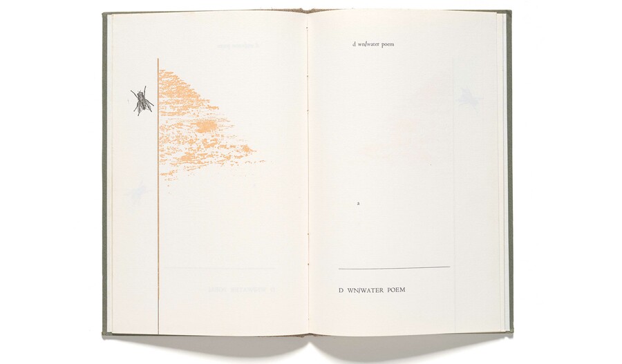
Bill Manhire / Andrew Drummond Dawn/Water 1978. Hawk Press, Ōkiwi Eastbourne. Alan Loney Collection, Robert and Barbara Stewart Library and Archives, Christchurch Art Gallery Te Puna o Waiwhetu
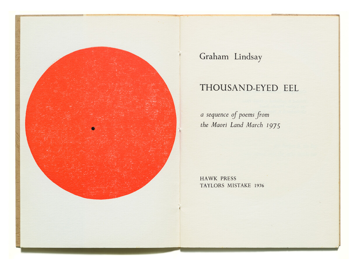
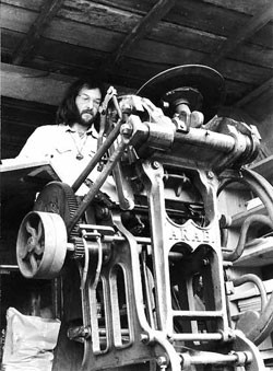
I doubt that any printer’s first book has proved more wholly apposite than Pathway To The Sea, printed by Alan Loney in 1975 at his newly founded Hawk Press. There is propriety in the contributors. The writer, Ian Wedde, achieved prominence as a poet and critic, as Loney has; the cover artist, Ralph Hotere, believed strongly in the crosspollination of art and literature, as Loney does. And there is propriety in the title, which poetically evokes Loney’s trajectory in Aotearoa New Zealand. Born in 1940 in Te Awakairangi Lower Hutt, he came to printing through poetry. In 1971, he typeset his first collection, The Bare Remembrance, at Trevor Reeves’s Caveman Press in Ōtepoti Dunedin. Hawk Press was set up at Te Onepoto Taylors Mistake and later travelled with Loney from Ōtautahi Christchurch to the Kāpiti Coast and Ōkiwi Eastbourne. After its closure in 1983, he established further presses in Te Whanganui-a-Tara Wellington and Tāmaki Makaurau Auckland. In 1998, he left Aotearoa, crossing Te Tai-o-Rehua Tasman Sea and alighting in Naarm Melbourne, where he settled permanently in 2001.
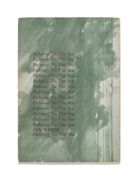
Ian Wedde Pathway to the Sea 1975. Hawk Press, Te Onepoto Taylors Mistake (cover designed by Ralph Hotere). Alan Loney Collection, Robert and Barbara Stewart Library and Archives, Christchurch Art Gallery Te Puna o Waiwhetū. Reproduced by permission of the Hotere Foundation Trust
I imagine that the beginning of Hawk Press felt like hard going. The foundational Arab treadle platen press arrived at 199 Taylors Mistake Road broken. Loney later wrote, “It had not been adequately tied down, and did not survive, on the way to Taylors Mistake, the very sharp turn at the bottom of Scarborough hill.”1 Welded back together it worked all right. For the cover of Pathway To The Sea, Hotere provided a watercolour, rather than the line drawing that Loney had requested, and so reproduction of the image had to be outsourced to a commercial offset printer, entailing extra cost and a lost opportunity to explore the printing of images in-house. There was an issue with the binding thread – Loney had wanted to use a coloured thread, to harmonise with the coloured ink chosen, but the thick nylon he procured proved too slippery to hold a knot. An off-white linen thread was used instead, and this became the standard for Hawk Press books, most of which would be typeset and printed by hand, handsewn into card covers and issued in editions limited to a few hundred copies.
Pathway To The Sea bears no traces of its bumpy ride into the world, a fact made more impressive when one considers that it was not merely Loney’s first book but his first effort at printing altogether. As an object, the book harmonises with its content. The core text takes the form of an extended poem exploring natural and built environments. A dedication opposite the title page decries the development of an aluminium smelter at a settlement at the mouth of the Otago Harbour, Aramoana, the name of which is often translated as ‘pathway to the sea’.
The cover image is the deep green observed in the sea around Aotearoa. Titles and the dedication are printed in red ochre, evoking earth, excrement, timber and industrial structures in decay. Pathway To The Sea (with ‘to’ and ‘the’ thus capitalised, giving the words uncommon weight) cascades down the front cover, replicated fifteen times. The strategy turns the phrase into a chant, a mantra, and calls to mind the use of repetition, in place of elaborate display type, in certain nineteenth-century advertisements.
Edgar Mansfield 11.2.80…On Creation 1981. Hawk Press, Ōkiwi Eastbourne. Alan Loney Collection, Robert and Barbara Stewart Library and Archives, Christchurch Art Gallery Te Puna o Waiwhetū
Initially, Loney worked with a limited stock of type at Hawk Press, partly out of necessity (not many typefaces suitable for hand-setting were available to him), and partly because he wished for the books that he printed to feel related. The first few contained only Eric Gill’s Perpetua and its companion italic, Felicity. These faces had been much used in the first half of the twentieth century – especially for display – by fine presses, such as the Golden Cockerel Press of England, and literary publishers, such as Faber & Faber of England and the Caxton Press of Aotearoa. Loney made them his own by, for instance, placing an emphasis on asymmetry and using different colours of ink, font sizes and page sizes. Over time, he acquired a range of display types, which permitted considerable diversity of identity, while the text type (in Perpetua/Felicity and, later, Centaur) maintained the family resemblance. Loney played with rules and geometric shapes, and brought in significant artists like Robin Neate, Janet Paul and Andrew Drummond to serve as illustrators.
Joanna Margaret Paul Imogen 1978. Hawk Press, Oruamatoro Days Bay. Alan Loney Collection, Robert and Barbara Stewart Library and Archives, Christchurch Art Gallery Te Puna o Waiwhetu
The literary works Loney chose to print also contributed to the development of a recognisable Hawk Press identity. Following in the footsteps of influential New Zealand typographer-publishers of the first half of the twentieth century, such as Denis Glover, co-founder of the Caxton Press, and Robert ‘Bob’ Lowry, Loney aimed to “print well what was worth printing” (to borrow a phrase associated with Glover).2 That is, he wished to print work that he believed to be important. Hawk Press placed an emphasis on poets of the post-war generation, poets who tended to be progressive in their politics and in their experimentation with form, punctuation, spelling and tone, including Alan Brunton, Graham Lindsay, Murray Edmond, Joanna Margaret Paul, Bill Manhire, Elizabeth Smither and Michael Harlow. As a general rule, Loney would seek manuscripts from specific authors. Of Brunton’s Black & White Anthology (1974), the fourth Hawk Press book, he has commented:
This work confirmed for me a process which served my whole printing life very well and which was started, almost inadvertently, with Ian Wedde’s Pathway To The Sea: most of the texts I ever printed, at least 80% of them, were solicited, and all of those which were sent to me by invitation were printed. The issue was that I wanted to print particular authors, and if I was going to put them to the trouble of preparing something for me, then I had better be clear that the decision to publish was made before I received the material and not after. In all the years I did this, not one person abused this offer or treated it cheaply. It turned out to be simply the way I worked and liked to work.3
Like Glover and Lowry, Loney helped to shape, and reshape, the local literary canon. Some of the writers he championed remained marginal – by chance (some left New Zealand), choice, or the limited vision of the critical establishment, which Loney has frequently denounced in thoughtful writings. But many became leading voices from Aotearoa. It is important to note that Loney’s interests were never parochial. His own poetry was heavily influenced by the work of American poets, especially Charles Olson and Louis Zukofsky, and his writing and printing both found purchase in an international network. His second collection of poetry, dear Mondrian, printed at Hawk Press in 1976, was enthusiastically reviewed by the well- known Black Mountain poet Robert Creeley, who met Loney in Aotearoa that same year.4 Hawk Press subsequently published Hello (1976), a book of poems by Creeley concerning Aotearoa. Many of the copies were exported.
Loney’s activities at Hawk Press were not confined to his own publishing projects. On occasion, he printed books and pamphlets for other publishers – for instance, Pat White’s Signposts (1977) for Michael Harlow’s Frontiers Press, and Clive Faust’s Metamorphosed from the Adjacent Cold (1980) for Cid Corman’s Origins Press in Boston. In 1982, he printed the text for Taste Before Eating, a portfolio of linocuts and recipes by artist Marilynn Webb produced to accompany a show of the same name at the Dowse Art Museum. He also took on ‘jobbing work’, particularly the printing of invitations to book launches and exhibition openings. These projects provided “a constant flow of new typographical challenges that kept the typographer on his toes”.5 Over time, Hawk Press books became noticeably more ambitious and experimental. Lavish bindings were introduced. Edgar Mansfield’s 11.2.80: On Creation (1981) was bound in quarter cloth with boldly printed, paper-covered boards; J. C. Beaglehole’s The New Zealand Scholar (1982) was bound in quarter goatskin with cloth-covered boards.
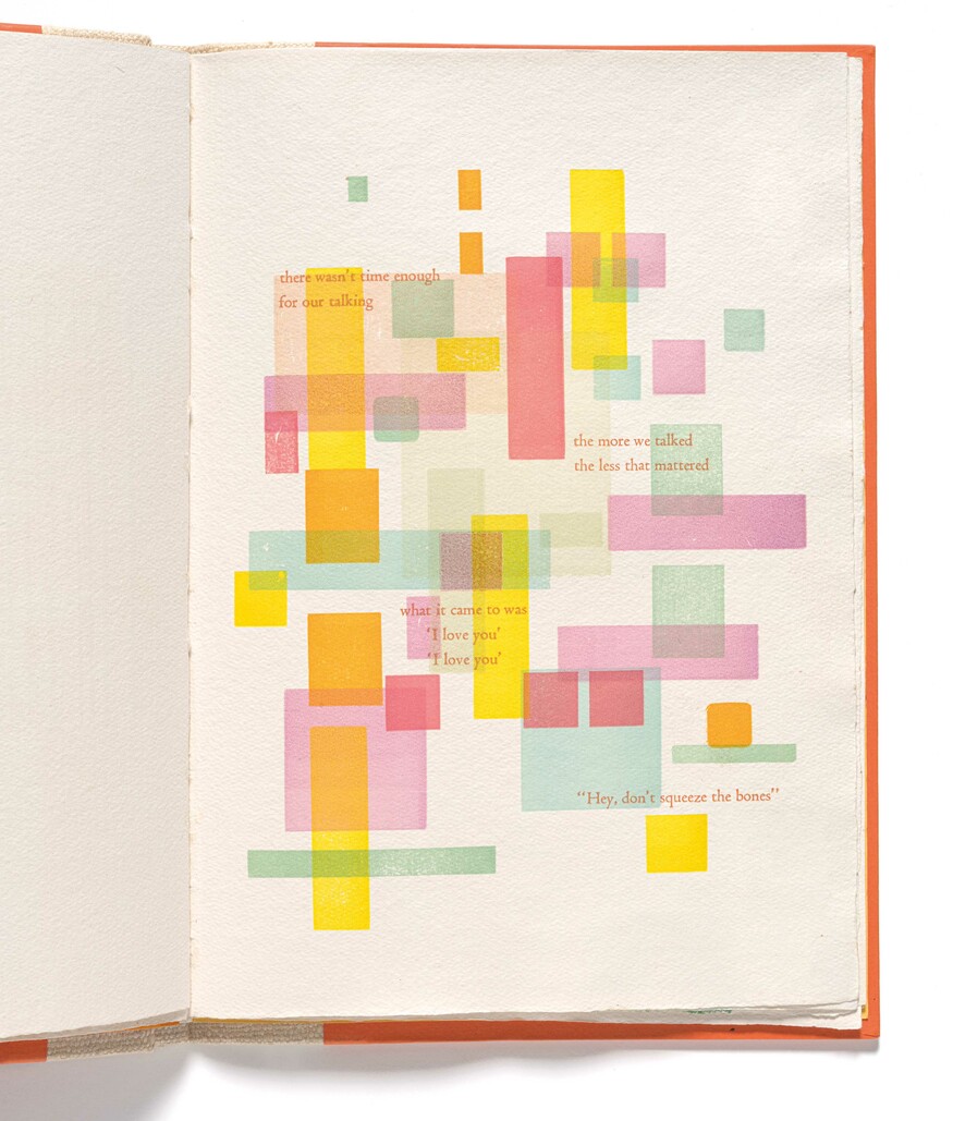
Alan Loney Squeezing the Bones 1983. Hawk Press, Te Whanganui-a-Tara Wellington. Alan Loney Collection, Robert and Barbara Stewart Library and Archives, Christchurch Art Gallery Te Puna o Waiwhetu
The final Hawk Press book was Loney’s own Squeezing the Bones (1983). Issued in an edition of just fifteen copies, it was the twenty-eighth major publication from the press. The design and printing exude confidence and freedom. Variegated words and shapes dance across the pages. The work formed a brilliant swansong for the press and represented the culmination of Loney’s career as a printer to date. It confirmed his status as a book-maker with a distinctive, hawk-sharp eye and pointed to the future. Hawk Press was followed by Black Light Press and the Holloway Press (co-founded with Peter Simpson at the University of Auckland Waipapa Taumata Rau) in Aotearoa and Electio Editions in Australia. Loney’s reputation as a printer and writer grew, especially abroad, his two practices reinforcing one another and increasingly intertwining. Today, his accumulated output exists as a kind of ocean. Vast, varied and of near- endless possibility, it sparkles with letterforms and images, and the spaces that define them, disperse them, wash meanings about them.6
Related
Exhibition
Archive Lounge: Hawk Press 1975-1983
3 May – 19 August 2025
A selection of beautifully designed and printed Hawk Press books presented to the Gallery by Alan Loney.
Exhibition
Dark Arts: Twenty Years of the Holloway Press
6 October – 16 November 2014
Established at the University of Auckland in 1994, the Holloway Press has been in the vanguard of fine printing in New Zealand for twenty years, engaging some of New Zealand's leading writers and artists.
Exhibition
Pressed Letters: Fine Printing in New Zealand Since 1975
30 August – 11 October 2012
An exhibition presenting some of the finest examples of letterpress printing produced in New Zealand from 1975 to the present.
Exhibition
Alan Loney: Poet and Printer
5 September – 28 September 2008
A selection of books by Alan Loney, one of the foremost printers of hand-crafted books in Australasia. Includes finely printed examples of his work from Hawk Press, Blacklight Press, Holloway Press and Electio Editions.