B.205
B.
Bulletin
New Zealand's leading
gallery magazine
Latest Issue
B.22302 Mar 2026
Contributors
Director's Foreword
Director's Foreword
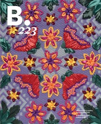
Welcome to the spring edition of Bulletin. As I write this, the country has once again entered a period of level four lockdown, which will mean some uncertainty and anxiety for many of us. It's not yet clear when we will leave lockdown, which means that printing deadlines and exhibition openings dates may have to be moved, so please do check on our website for updates.
Commentary

Art Over Nature Over Art
Place branding increasingly stands as both a visual practice and a modality of governance. That is what makes it slippery. There is much more to branding than a logo or style. It is a manifestation of power.
Commentary
Ilam and Bulletin
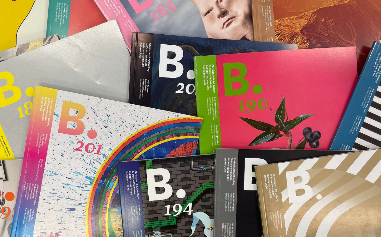
This issue of the magazine is the final one to be designed by the students of the Ilam School of Fine Arts at the University of Canterbury. Bulletin’s relationship with Ilam began back in 2014, when senior lecturer in design Aaron Beehre proposed an internship programme that would allow his students to work on the magazine under his supervision. With Aaron as art director, the first issue of the magazine produced at Ilam was B.175, still in the large square format designed in 2008 by Strategy. With a few issues under their belt, Aaron and his students redesigned Bulletin into the current iteration of the magazine, which we launched in March 2016 shortly after our reopening post-quake. At the time, then director Jenny Harper hailed it in her foreword as the “first edition of Bulletin in a new world”, and most importantly with “more pages for art”.
Commentary
The Meeting of Two Queens
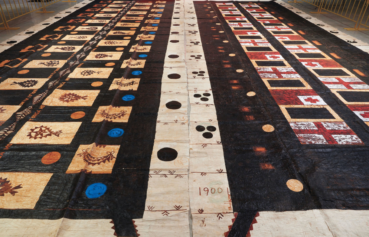
A blue dot – warm, mid-blue – that repeats across Tongan artist Kulimoe'anga Stone Maka’s ngatu tā'uli Toga mo Bolata'ane (Tonga and Britain) (2008–10) recalls the first time the artist saw blue eyes.
Commentary
In Plain Sight
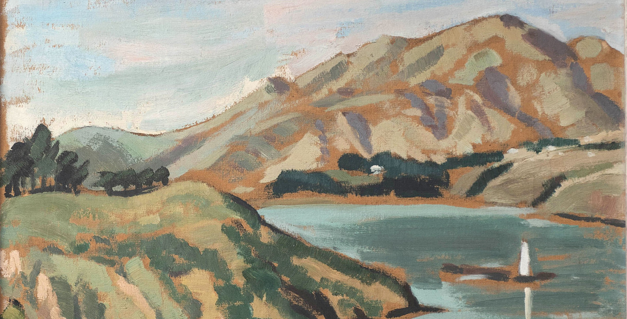
Margaret Lady Frankel (née Anderson) (1902–1997) is always listed as a founding member of the Christchurch artistic collective The Group, and is best remembered for her leading role in securing Frances Hodgkins’s Pleasure Garden painting for the Robert McDougall Art Gallery in 1951. However, despite exhibiting more than 100 works, including paintings, drawings, prints and pottery, in the city over a thirty-year period, her art is virtually unknown – hidden in private collections or perhaps lost – and consequently her wider contribution to The Group continues to be overlooked.
Interview
Texture of the Time
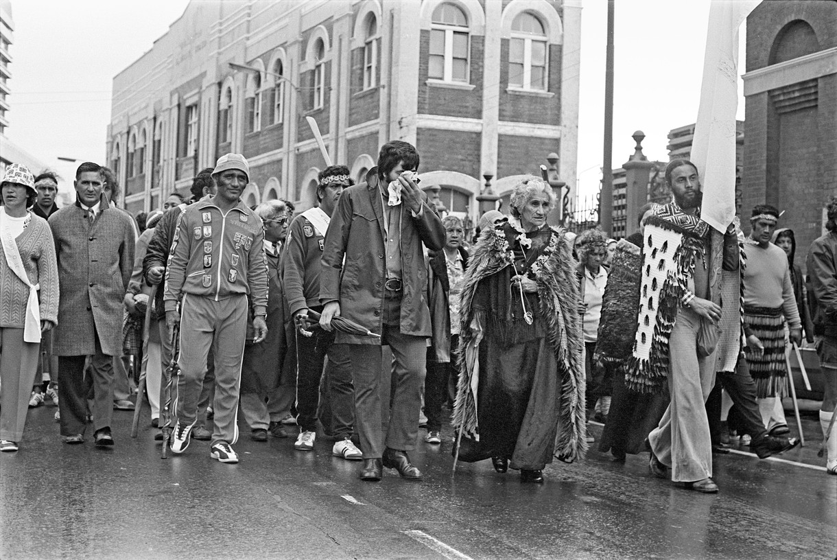
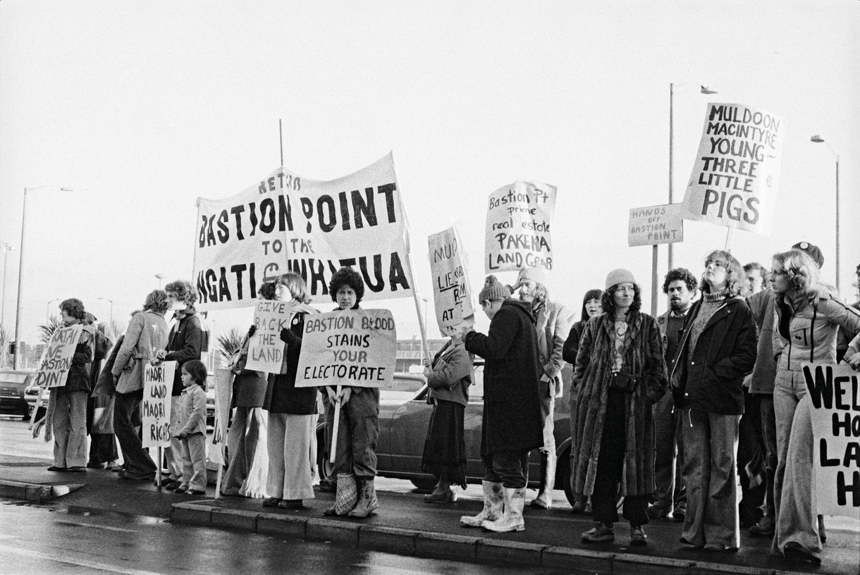
John Miller (Ngāpuhi) is a special figure in Aotearoa, having photographed protests and important events throughout the country from 1967 right up until the present moment. His work covers everything from the 1960s and 1970s anti-Vietnam war and anti-nuclear protests to the 1975 Māori Land March, 1977–78 Bastion Point occupation and 1981 Springbok Tour protests, as well as many more examples of civilian dissent. John uses the camera as a witness, capturing moments of collective voice in action, and he also honours the people who have led the charge for changes in thinking and our society. Looking at his work is like walking through our history backwards into the future. Curator Melanie Oliver sat down with activist John Minto and photographer Conor Clarke (Ngāi Tahu) to talk about John Miller’s work.
Commentary
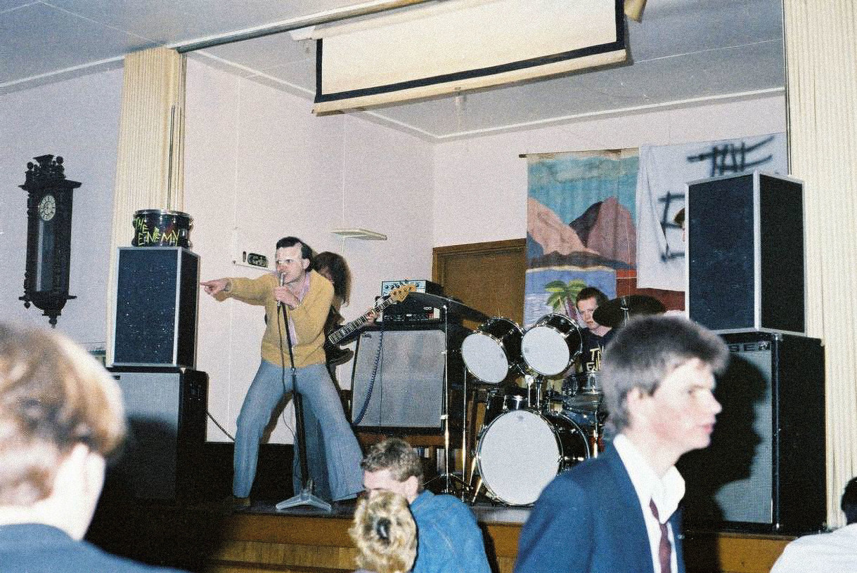
The Dunedin Christchurch Sound
A particularly romantic image attached to the record label Flying Nun shortly after its inception in 1981: journalists claimed it captured the purity of musicians playing without regard for fame or fortune. The label’s output became collectively known as the Dunedin Sound and formed the basis of a reputation that has shrouded Dunedin in classic rock mythology and mystery for the last forty years.
My Favourite
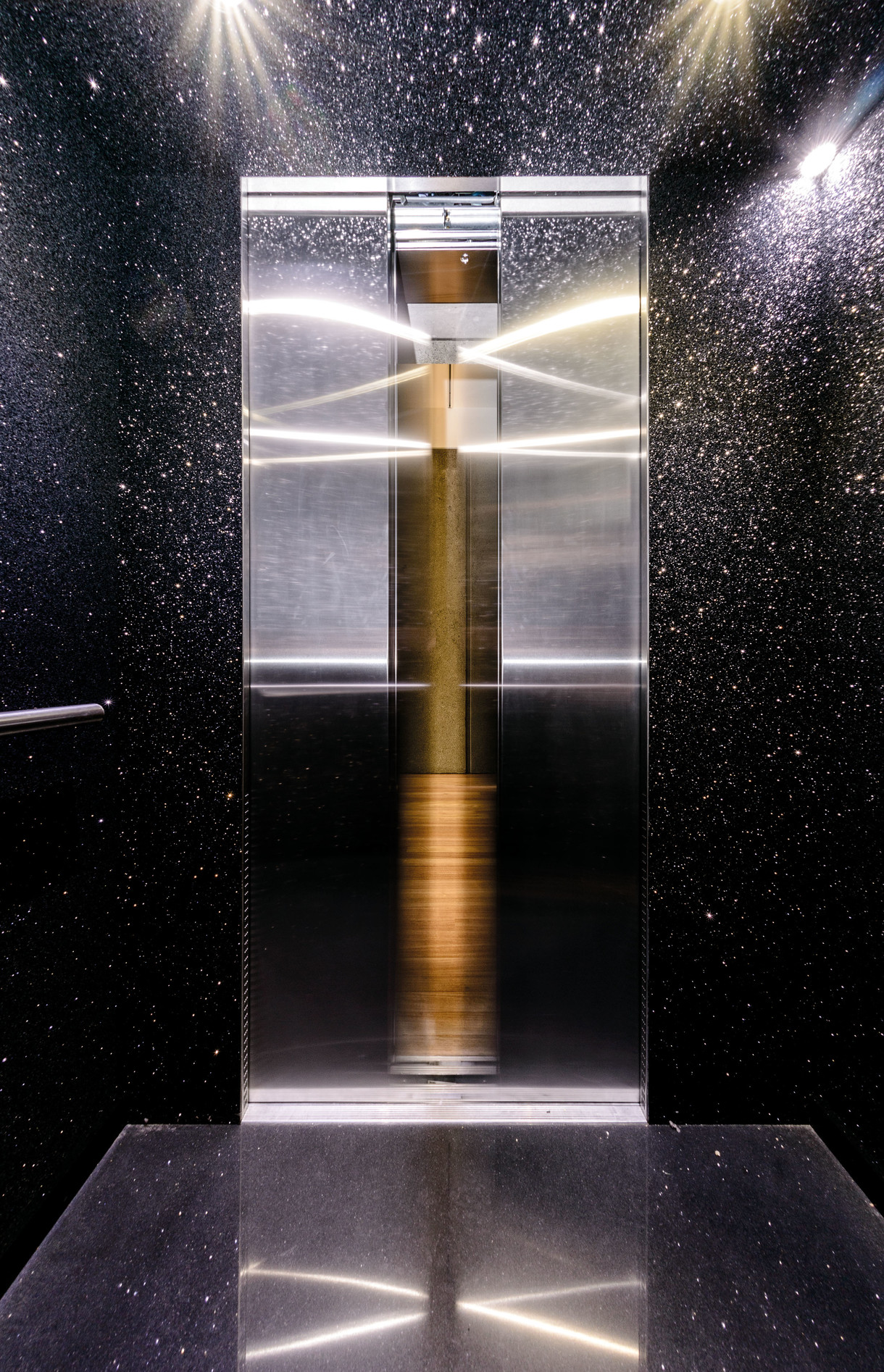
Reuben Paterson - The End
I am a clown. I spent my whole life perfecting the art of idiocy, learning my trade outside the Gallery on the corner of Worcester Boulevard and Montreal Street – cutting my teeth as a street performer. Then one day, I was invited to step inside the Gallery, to write about art. Naturally, I felt nervous, but excited.
