B.
International Book Day
Behind the scenes
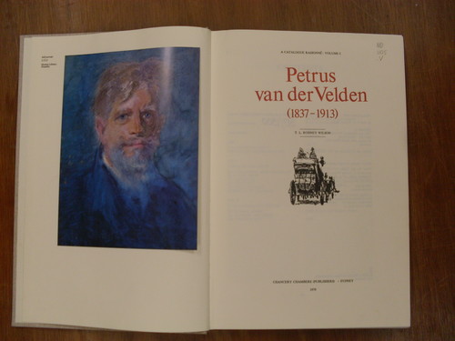
I was lucky enough to recently acquire my own copy of one my favourite books, Rodney Wilson's two-volume, case bound Catalogue Raisonne of Petrus van der Velden.
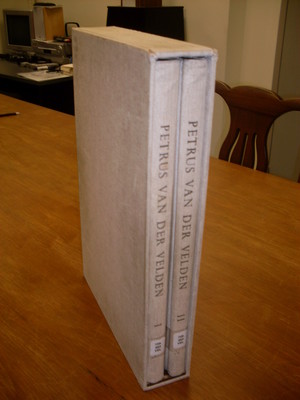
Rodney Wilson Petrus van der Velden - A Catalogue Raisonne, Chancery Chambers, Sydney, 1979. Printed at the Caxton Press, Christchurch.
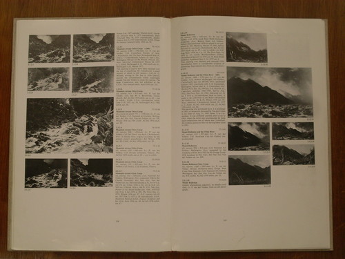
Published in 1979 this book is the result of Wilson's extensive research throughout the 1970s of one of New Zealand's most significant artists, Petrus van der Velden (1837-1913). Thirty-four years on and the book has not dated, it's a damn good read and remains the definitive account of van der Velden's life and work with some incredibly informative observations by Wilson. Van der Velden's correspondence is also included, translated by Wilson it provides an enlightening insight into the thinking of this renowned painter. Volume 2 contains an exhaustive catalogue of van der Velden's paintings and drawings, each work accompanied with title / date / medium / measurement and provenance where available.
If there is one niggle I have about this book it is the fact that it is usually a reference only book and therefore if you don't own a copy it is only available to read in libraries.
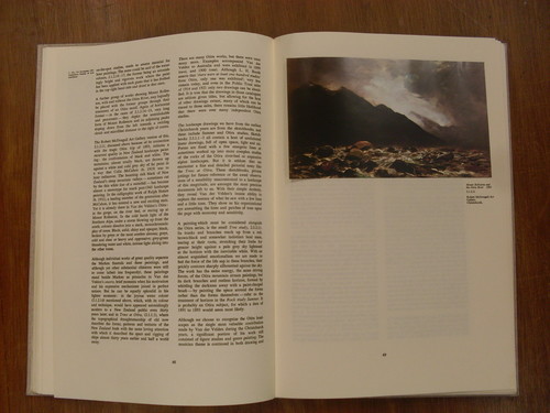
Petrus van der Velden - A Catalogue Raisonne is a testament to book design and production in Christchurch and remains a highpoint of quality 20th century publishing in New Zealand. It was designed by one of Christchurch's most notable graphic designers and typographers, Max Hailstone (1942-1997) and printed at the Caxton Press on Victoria street here in Christchurch. Hailstone did a superb job on the design, selecting an elongated foolscap / folio page layout on which the text is set in two columns and spaciously laid out. The paper stock is heavy and thick and ideal to take the impression of the metal linotype set text, printed old style at the Caxton Press. The text itself is slightly embossed and gives the pages a strongly tactile quality that complements the visual appearance of the type, an effect that modern digital printing can never hope to achieve. Indeed this book, published in 1979, was printed at the end of the letterpress era as metal type was rapidly superseded by offset printing and computer technologies thoughout the 1980s and 1990s. High quality colour plates are tipped in throughout the book and both volumes and accompanying slipcase are beautifully bound in woven brown / cream cloth that has been embossed with the title and a profile portrait of van der Velden.
My pick for International Book Day - its got to be good for you.
Related
Exhibition
McCahon / Van der Velden
18 December 2015 – 11 September 2016
An exhibition of two of New Zealand's most respected painters.
Exhibition
Van der Velden: Otira
11 February – 22 February 2011
This exhibition brings together a comprehensive selection of Van der Velden's paintings portraying the wild, untouched natural beauty of the Otira region's mountainous landscape.
Collection
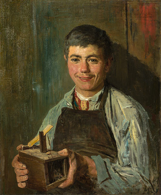
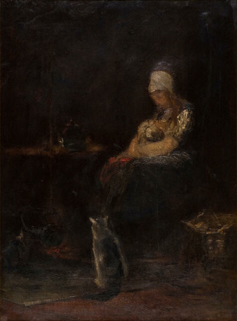
Petrus van der Velden The Mouse-trap
The Dutch painter Petrus van der Velden arrived in Christchurch in 1890 for what was intended to be a short visit to New Zealand. Staying longer than he had planned, he made an impact on the local scene as a ‘real artist’ from old Europe in their midst.
This painting was shown by a Christchurch art dealer in 1893, and described by a reporter:
The picture is entitled ‘The Mouse-trap’, and represents a boy holding the trap with a mouse in it which he has just caught. The face of the boy is beautifully painted, the expression of pleasure being very cleverly caught.
(Beasts, 2015)
Collection
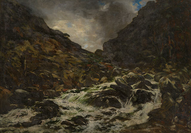
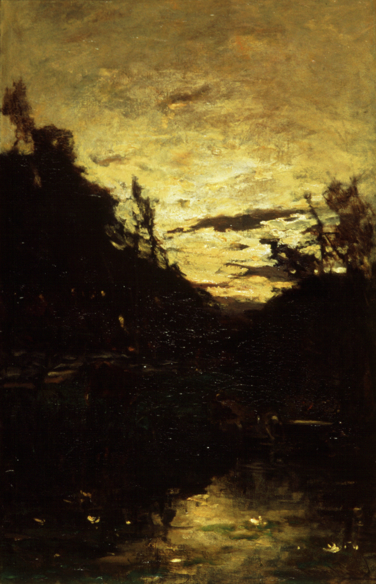
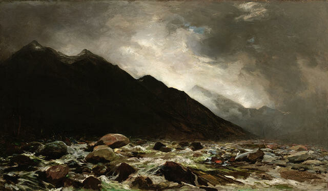
Petrus van der Velden Mountain Stream, Otira Gorge
The Rotterdam-born Petrus van der Velden arrived in New Zealand in 1890. Following his first visit to Otira Gorge in January 1891, he became engrossed with this subject, and painted its powerful, surging torrents many times over the next two years.
This painting was purchased by Gilbert Anderson, a leader in New Zealand’s frozen meat industry, also involved with the Canterbury Society of Arts. Anderson sold it to the Society in 1912; it was purchased from them in 1996 through the Community Trust and Christchurch Art Gallery Trust.
(Treasury: A Generous Legacy, 18 December 2015 – 27 November 2016)
Collection
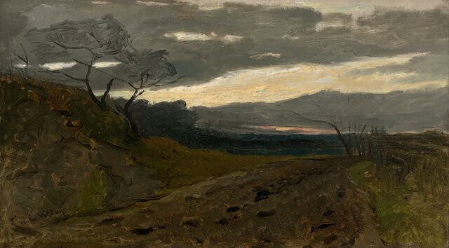
Petrus van der Velden Canterbury landscape with a nor’west sky
Petrus van der Velden’s nor’west sky stretches across the landscape in dirty greys, apricot whites and a slither of pink to converge above a dark and scraggy landscape. You can sense the earth exists beyond van der Velden’s frame, and his expressive gestures reveal layers of paint and even the canvas texture below. The effect is to capture the sense of drama and exposure one feels at particular times along the Canterbury Plains.
(Endless Light, 29 June 2019 – 8 March 2020)
Collection
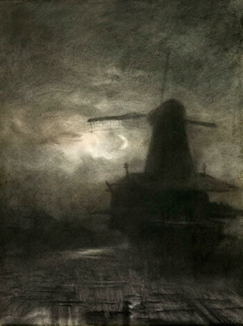
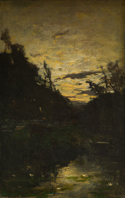
Petrus van der Velden Windmill by Moonlight
“The greatest of all lessons is to learn to see. Many are ‘colour blind’ till they have their eyes opened to nature’s lessons, which she is always trying to teach us. But we must always tell what nature says to us, simply and directly without pretence or falsehood. Tell the Truth. Christ was the greatest artist. His words and pictures are a simple telling of nature's lessons – they are always the Truth. ‘We reason with colours. Colours are dead’, but by telling what nature teaches us the dead colours enable us to express the wonders and beauties of the Creator’s work.”
—Petrus van der Velden
(McCahon / Van der Velden, 18 December 2015 – 7 August 2016)
Collection
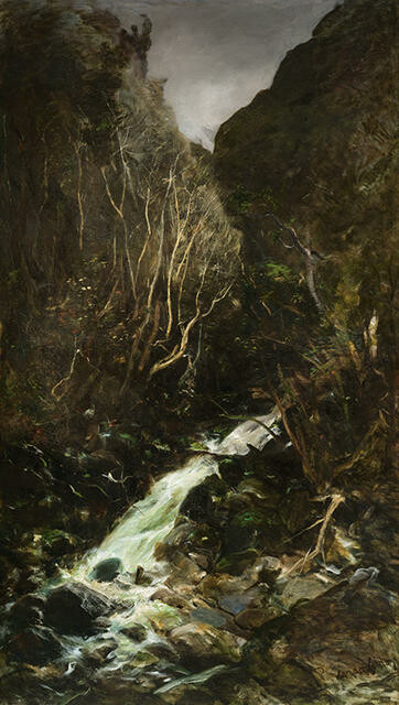
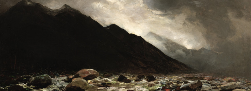
Petrus van der Velden Jacksons, Otira
Petrus van der Velden established a successful reputation as a painter in the Hague during the 1870s and 1880s. It therefore is astounding that he gave his career away in 1890 and sailed with his family halfway round the world to Christchurch. Holland’s loss was New Zealand’s gain, however, and within a short time of his arrival van der Velden travelled to the mountainous Otira region, where he painted some of the most important works of his career. He was captivated by the untouched beauty and ruggedness of a landscape that was so inherently different to what he had known in Holland. He began producing a series of paintings based on a mountain stream at Otira and on his second visit to the region in 1893 painted this small creek at Jacksons just to the west of Otira.
(March 2018)
Collection
![Burial in the Winter on the Island of Marken [The Dutch Funeral]](/media/cache/81/09/810948cfa92f756f6d5ceb4f03044ac5.jpg)
Petrus van der Velden Burial in the Winter on the Island of Marken [The Dutch Funeral]
Research for the exhibition Closer (16 December 2017 – 19 August 2018) resulted in the restoration of this work's original title. In Dutch 'Begrafenis in den winter op het eiland Marken' and in English 'Burial in the winter on the island of Marken'.
Combining a wintry landscape with an equally bleak portrayal of loss, this painting has captivated many visitors since joining the Gallery’s collection in 1932. Small details, like snow-dusted shoes, noses red with cold, and a woman folded over by grief, are observed with such accuracy and tenderness by Petrus van der Velden that this funeral procession on an isolated Dutch island feels just as real as it looks. However, its most important figure – the reason for the gathering and for all the grief we see – remains unseen. The deceased, said to have been a drowned local fisherman, is present only in the dark shape of the coffin – and in the faces of those left behind.
(Absence, May 2023)
Collection
Petrus van der Velden Mount Rolleston and the Otira River
Talking about his first visit to Ōtira in 1890, Rotterdam-born artist Petrus van der Velden later recalled, “For the first three days I did nothing at all but just looked, it took my breath away.” A highly skilled professional artist with substantial exhibiting experience in the Netherlands, van der Velden prioritised capturing or expressing emotion in his art over recording the physical features of the landscape. The awe-inspiring setting aided him in this pursuit – especially during stormy weather – and drew him back again and again.
He Kapuka Oneone – A Handful of Soil (from August 2024)
Collection
Petrus van der Velden Nor'western Sky
“‘Colour is light’ and there is no darkness at all – there is light or less light. In each part, even the darkest, there is some light and the difficulty is to get the different kinds of light showing in even quite small parts. There are no hard lines in nature – the light shines in and round everything and breaks all the hardness by modifying and diffusing the apparently sharp edges.” —Petrus van der Velden
(McCahon / Van der Velden, 18 December 2015 – 7 August 2016)
Collection
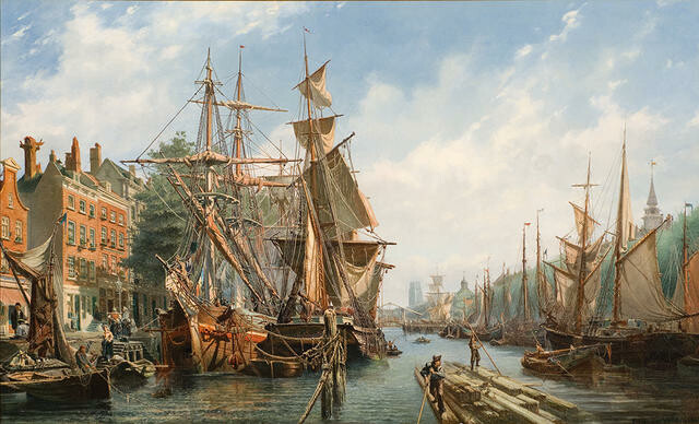
Petrus van der Velden The Leuvehaven, Rotterdam
Petrus van der Velden turned to painting full-time in 1867 after six years as a struggling self-employed lithographer. “The first year was the hardest, and at the end I had done a picture; the harbour and the ships”, he later recalled. Exhibited in Rotterdam and then the Antwerp Salon, it sold to “an English gentleman … for 300 guilders [£25]. Quite a fortune!”
(Out of Time, 23 September 2023 – 28 April 2024)
Collection
Petrus van der Velden Nor’western Sky
The hot, dry nor'west winds of Canterbury produce dramatic cloud formations and an atmospheric light. Petrus van der Velden has captured these effects with what is probably Christchurch's River Avon in the foreground. He lived near the river between 1890 and 1893. The colonial woman bent over, occupied with her task of work, has echoes of his earlier Dutch paintings, which focused on Dutch peasants at work. Van der Velden painted in a realist manner, which was influenced by his association with the Dutch Hague School of painters who favoured dark sombre tones and a loose style of brushwork. The nor'west scene is created by using strong contrasts of light and shade (chiaroscuro). Born in Rotterdam, Van der Velden established himself as a painter, particularly of marine subjects, in Holland, from where he emigrated in 1890. However, he struggled to make a living in Christchurch and in 1898 went to Sydney. He returned to settle in Wellington in 1904 but died in Auckland.
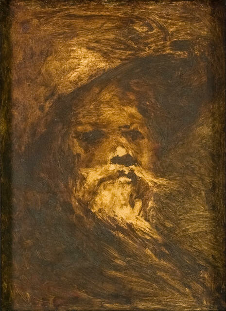
Collection
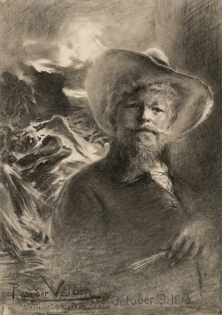
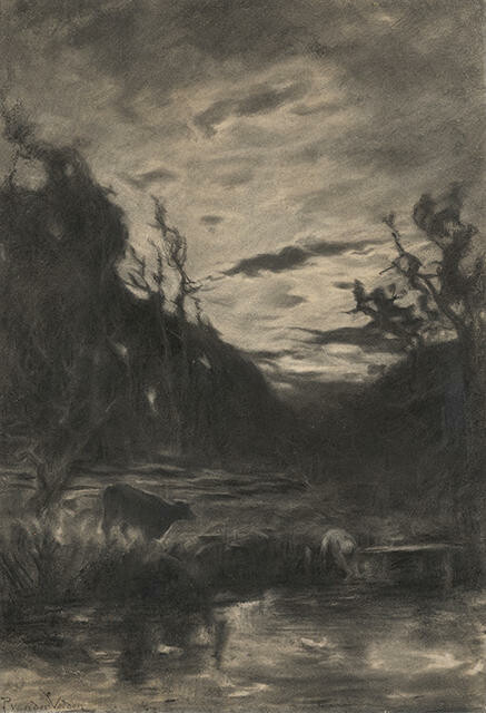
Petrus van der Velden Self Portrait with Otira background
Van der Velden: Otira, 11-22 February 2011
In this charcoal self-portait, completed just three weeks before his death, van der Velden remains emotionally in tune with the region and his earlier experiences as he pays modest homage to his Otira series. The artist portrays himself, paintbrushes in hand, standing in front of his 1912 painting Otira Gorge, proclaiming to the world the importance of his Otira paintings to him as an artist.