Bulletin Turns 200
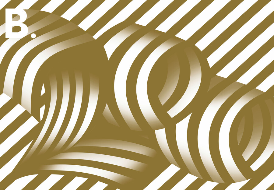
Aaron Beehre B.200 2020. Gatefold print.
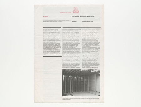
A cover photograph of a set of storage racks, a six-digit phone number and a simple address: Botanical Gardens, Rolleston Avenue. The first issue of Bulletin, sent to members of the Robert McDougall Art Gallery in the early months of 1979, was a no-nonsense, four-page, black and white, bi-monthly newsheet promising an informative diet of “news, views and reviews of activities” at the Gallery and “important visual arts news from Christchurch”.
Two hundred issues and five directors later, the journal is a full-colour, offset printed art magazine distributed to Gallery members, supporters, bookshops, libraries and other galleries nationally and internationally, and scooping up honours at the Museums Australasia Multimedia and Publication Design Awards and the Designers Institute of New Zealand Best Awards.
As director Blair Jackson says, the magazine has become an integral part of the identity of Christchurch Art Gallery Te Puna o Waiwhetū. “It is a place for ideas, opinions and experiments. It’s our shop window.”
That shop window has had some radical makeovers over its time.
Bulletin’s predecessor, Survey, was launched in 1971, as a periodic publication, wrote then director Brian Muir, informing the public about the activities of the gallery “and especially ... the addition of works to its collection.”
Seven years later, Survey was quietly shuffled off to the archives and the first Bulletin, the brainchild of education officer Ann Betts and new director Rodney Wilson, went to press. As well as being an unabashed drive for more members, the publication launched a new era of change for the under-sized and under-funded gallery. The first issue described the excavation of 140 square metres of compacted earth for new storage space under the old gallery. It laid out plans to photograph the collection, establish a “small conservation facility” and set up a new “library of archival material” (any old catalogues, books or magazines gratefully accepted). As well as previewing exhibitions, acquisitions and gifts to the Gallery were also celebrated – in 1980 a bicycle donated by A. G. Healing was found to be proving “immensely useful as an alternative to the van for small messages in the city”.
The following year, Wilson used Bulletin to hand over the director’s baton to artist and art educator John Coley, using column space to push the need for a bigger and better gallery with a classroom, library, “better workshops and so on”.
By the mid-1980s a new format designed by Saskia van Stockum used more colour and larger photographs. The page size was down, page numbers up. As readers were told, “We thought a bolder, bright design would make news of the Gallery’s events even more welcoming for readers.” And welcome they were. Throughout its now-considerable life Bulletin has been used as a platform for exhibition backgrounders, artist interviews, staff news, art events, obituaries and highlights from the collection.
Following the appointment of Tony Preston as director in 1995, change of a more radical nature was in the air as dreams for a “bigger and better” gallery neared fruition. Anticipating the change from the demure McDougall Art Gallery to the showy new Christchurch Art Gallery, a new “visual wardrobe” was planned including a Gallery-specific typeface (designed by London-based Jeremy Tankard) and a public profile that was professional and highly polished.
Over coffee with Ronnie Kelly, then manager of public programmes at the Gallery, Guy Pask, creative director of Strategy Advertising & Design, suggested Bulletin be part of this rebranding project. Now at Double Lux, Pask recalls Bulletin at that time as a small format in-house publication, recently changed from a bi-monthly to a quarterly. “But it didn’t reflect the quality and character of the exhibitions as strongly as it could.”
Pask brokered a deal with local printer Spectrum, and Strategy sponsored the creative side.
The new look Bulletin was high spec and highly stylised, using expressive typology and layout to reflect the tone of the exhibitions and lead article. Headings were bigger, artworks floated on imagined canvases of colour, staff pics filled whole pages, “I was quite influenced by magazines like Rolling Stone, where they would take their main article and that would have its own visual theme,” says Pask. “The core grid and typeface remain but if it gets too grid-based and too formulaic it begins to look like wallpaper. So we kind of mixed it up. I’d sit down with the editor and say what is coming up? What is the main exhibition? What is some way we could interpret this?”
The content too became more varied. The new-look publication, explained Preston in 2001, would showcase the work of more guest writers and include a greater focus on art theory and practice as well as keeping readers up to date with progress on the new Gallery site.
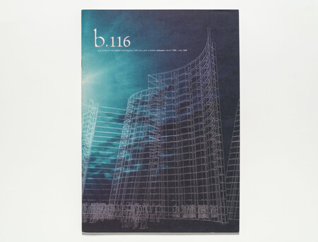
After Jenny Harper took on the role of director in 2006 and Blair Jackson came on board as deputy director, the publication went through another makeover in 2008. The “flourishy” script was dropped; the font became more consistent; and the format changed from A4 to something larger, squarer and bendier.
“We wanted to modernise it,” recalls Jackson. “Make it reflect the changes we were making to our exhibition programme.”
The content changed again to give more attention to the collection and behind-the-scenes activities of the Gallery. A series of “pageworks” was begun, showcasing artworks commissioned specifically for the pages of the magazine.
“It was a very good way of documenting what we do visually and intellectually, and to contribute to the art conversation,” says Harper. “I don’t think any other gallery was doing that. It had the potential to get us alongside other writers and to talk about art in a different way than if it had been entirely internal. And for the Christchurch City Council, it was another way of showing what we were doing – it was a relationship builder and a very nice thing to give friends and patrons.”
By 2014, however, key staff at Strategy were moving on and that relationship, says Jackson, had run its course. “We thought Bulletin could do even more for the Gallery, a change graphically as much as in content, to make the magazine more outwardly focused.”
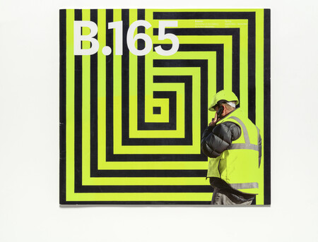
Aaron Beehre, senior lecturer in design at the University of Canterbury School of Fine Arts, stepped up to the mark, suggesting Bulletin be used as a research project for graphic design students. Beehre had worked previously with the Gallery on a number of publications and it made more sense, says Jackson, than an agency doing it. “We are about artists and through the School of Fine Arts we now have artists designing it.”
It takes commitment – students, currently two Year 3 students, have to come in during holidays to ensure deadlines are met. “It has so much potential,” says Beehre. “And I love the fact the Gallery publishes it and believes in it.”
For students, it is an opportunity to apply their knowledge in a real world setting. “It is not an abstract experience,” says SoFA head Aaron Kriesler. “They’re having to get the work production values right and they take pride in seeing something viewed around the country that they are associated with.”
As part of these changes Bulletin editor David Simpson initiated an editorial committee to ensure voices from smaller galleries, the university and the wider arts communities feed into the process as much as Gallery curators. For Simpson, “It’s about keeping the magazine as outward facing as possible.”
In 2011 the magazine had no choice but to face outwards. After the earthquake of 22 February, the Gallery had to close its large glass doors for five years of repair work. Bulletin, together with the newly redeveloped website, helped to keep the “gallery without walls” in the public eye. Covers from this period provide a catalogue of broken buildings, base isolators, crated artworks and Martin Creed’s ever-hopeful EVERYTHING IS GOING TO BE ALRIGHT (Work No. 2314, 2015) glowing over a dark and deserted Worcester Boulevard. Gallery curators kept readers up to speed with a programme of temporary installations, pop-up shows, fundraising initiatives and outdoor events while guest writers gave new perspectives on the future direction of the changing city.
Bulletin’s efforts were noticed. As Emma Bugden, curator at Lower Hutt’s Dowse Art Muesum noted in 2014, without a gallery programme to reflect and promote, Bulletin became “more discursive, bringing in external topics and writers, with a particular focus on the impact and implications of the changing urbanscape of Christchurch.”
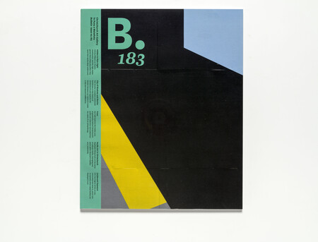
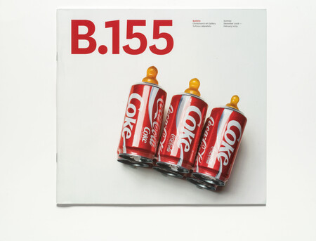
The reopening of the Gallery on 19/20 December 2015 ushered in 10,000 people over one weekend and a new-look Bulletin. Edited by Simpson and Elizabeth Davidson, with contributions from staff, photographer John Collie and guest writers, B.183 had a smaller format closer to A4 in size, a spine and a distinctive coloured band running down the left-hand side of the cover.
“So here we are,” wrote Harper in her foreword. “The first edition of Bulletin in a new world, or so it seems; it’s in a new format – a handy size which will be easier to shelve, but best of all, there are more pages for art. … It also comes with a few apologies for those who’ve worked out how to stack the large floppy-covered Bulletin we introduced at the end of 2008. Plus ça change!”
Under Jackson’s directorship, the magazine has bedded down regular coverage of exhibitions and events (now supplemented by the smaller What’s On guide), articles, interviews, “My Favourite” contributions, “Postcards” from expat Kiwis and artists on residencies, and more pageworks. The tone is accessible – the Gallery, says Jackson, has a different voice from other galleries – and the design experimental. As well as being a record of what happens at the Gallery, says Jackson, it is also part of what happens – in the last issue, for example, artist and curator Holly Best invited eight writers to respond to works from her group show Uncomfortable Silence.
Still, change remains a constant feature. Over the years there have been issues designed for iPads; issues flashing a metallic cover, a perforated cover, a Risograph cover. The dot after the B has come and gone, the band on the cover has been known to disappear, and the director’s portrait has gotten smaller and now vanished altogether. The result, says Kreisler, is a welcome air of “grittiness and materiality”.
“If something is over-slick and looks like a brochure, you might spend less time with it, or you might wonder what you are being sold. This is a municipal gallery so it should be different from dealer galleries – it doesn’t have to be such a smooth operation, it doesn’t have to be over-branded to prove its worth.”