In The Studio
Bridget Riley in conversation with Paul Moorhouse
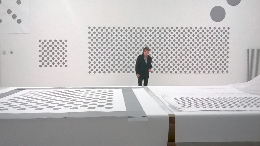
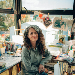
Bridget Riley in her studio, 2017. Photo: Paul Moorhouse
Paul Moorhouse: We are standing in front of a full-size cartoon for Cosmos, the new wall painting that will be installed at Christchurch Art Gallery. How does the cartoon relate to the final wall painting?
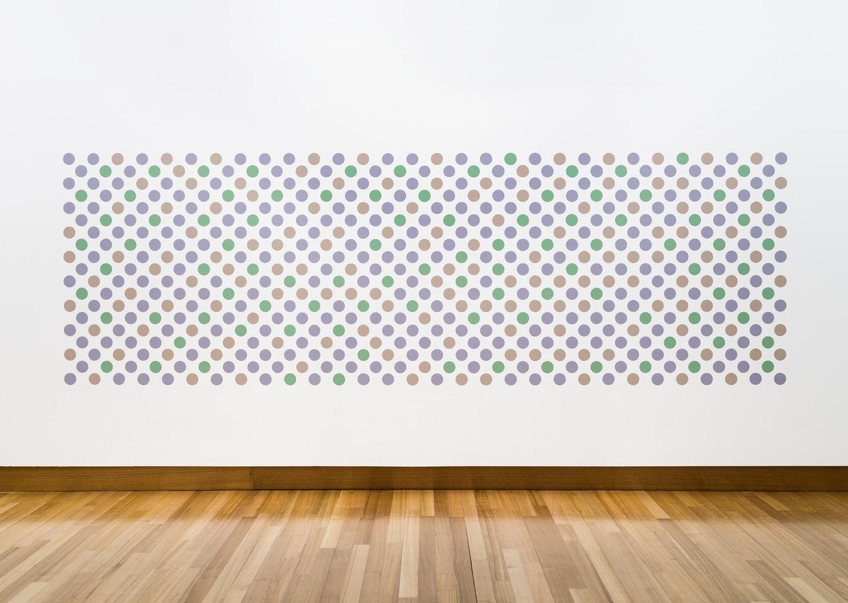
Bridget Riley: The cartoon is painted in gouache on paper, but it gives me a good idea of the full-scale image that will be recreated on the wall in Christchurch. I have also made a smaller painting in acrylic directly onto the wall here in the studio. This is complete in itself, and provides the information I need to give me confidence in the appearance of the discs when the larger image is created on the gallery wall.
PM: So, the cartoon enables you to foresee the complete image, and the smaller painting provides a sense of its physical presence?
BR: Yes, that’s right. I often work this way. My recent commission for a window at the Gemeentemuseum in Holland grew out of an earlier wall painting I did for Siegen, Germany, called Quiver 1 (2013). As part of my preparatory work I made same-size cartoons in both cases. I find this allows me to develop an image and anticipates many problems.
PM: How did the process of making Cosmos begin?
BR: In all my work—right from the beginning—each step I take develops out of what went before. For example, if I look now at a painting like Tremor, I see it very differently from the way in which I saw it in 1962. I see new possibilities and have hopes for some fresh insight. When I found the line of thought that led me to Cosmos, I was looking for a way out of Cascando (2015). I wanted to find some aspect of that earlier painting, its dynamic, which I could take further and for which I could find other formal terms.
PM: How do you go about reformulating the structure of a previous work?
BR: I can’t do this without reliving it, as it were. I have to reach a certain level of re-engagement with an earlier work—and I should add that this is not always possible. But with Cascando, I was able to penetrate its dynamic— the movement—and this in turn enabled me to continue and to take another step. I changed the unit, a triangle, to a disc. It followed that the organisation or structure also had to change. In Cascando, the triangles are tessellated, connected to one another. In Cosmos, the discs are discrete, separate.
PM: How would you describe the movement in both these works?
BR: It is primarily visual. The movement is created through looking. A painting like Cosmos may appear static at first glance, but the viewer’s engagement will bring it to life. Our powers of sight respond so astonishingly to exercise.
PM: This is why I see your art as truly democratic. The viewer is not passive but actively involved in a dialogue with the painting.
BR: Yes, I am glad you said that.
PM: In that respect, there are also parallels with music. A musical score requires a performer to bring it to life, and in a similar way the viewer animates your painting. Looking at Cascando and Cosmos in that active way, what do you see?
BR: The two paintings have certain pictorial factors in common, one being their long, horizontal format. This is very important, because as the eye moves across the image the length of the structure gives rise to successive, even contradictory, readings. Various diagonals contrast and switch, emerge, disappear and recreate themselves. They exist simply and solely through perceived relationships.
PM: Eventually the entire painting becomes a dynamic field. A static organisation of discs is activated, and even the flat surface seems plastic.
BR: All these factors endorse one another. As your eye moves through the space, it gathers information and this generates new perceptions, each of which is stated and then denied. Occasionally there will be a strong diagonal, acting like a chord in music, modified by a long horizontal movement.
PM: What I find remarkable about Cosmos is the way that all this perceptual activity is generated by three colours and their formal relationships: how can something so apparently simple can yield such visual richness?
BR: Both Cosmos and Cascando enjoy strictly limited means. Cosmos uses only three colours unified by their mid tonal pitch, while Cascando comprises just three forms: an equilateral triangle and two variations. Also, in each painting, whether I use a triangle or a disc, the unit is spaced regularly across the field. The means will be limited, but that only serves to open resources.
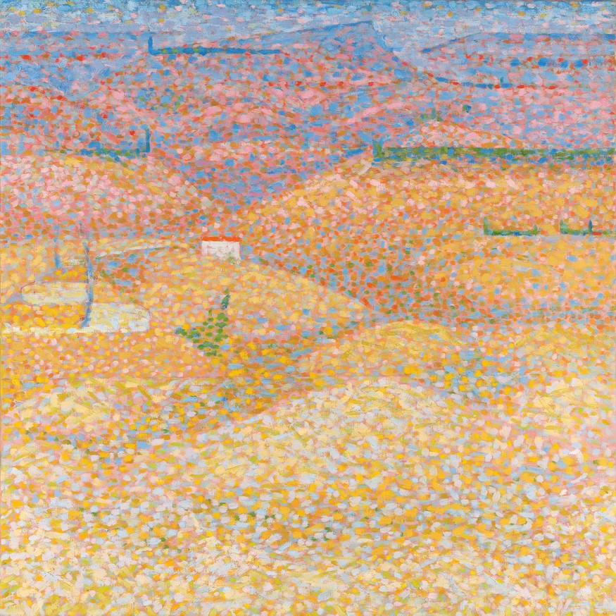
Bridget Riley Pink Landscape 1960. Oil on canvas. Private collection. © Bridget Riley 2017. All rights reserved
PM: Vapour 2 (2009) is one of the group of works being shown with Cosmos. The three colours in that work seem closely connected with the wall painting. Is that an antecedent also?
BR: Cosmos uses three closely related greys like Vapour. That is its connection with the earlier painting.
PM: But unlike Cosmos, which is organised in regular rows of discs, Vapour is structured as vertical stripes.
BR: That’s right, and consequently the viewer looks at them in totally different ways.
PM: Vapour is slower. The twisted stripe formation yields a perception of movement that builds very gradually, until it reaches a subtle tipping point.
BR: Then there is a fleeting spray or flash of light.
PM: Having begun the line of thought that led to Cosmos, how did this lead to the installation for Christchurch?
BR: Looking back now at the start of the work that became Cosmos, the steps I took seem quite inevitable, so clear and logical do they seem. But at the time, nearly two years ago, it was a leap, the outcome of which was far from sure. I tested out the terrain with collage, small discs painted in three greys. This enabled me to move things around, to find correspondences with Cascando. I made small studies, then a cartoon, and so arrived at the full-size image you can see here in the studio.
PM: How did you determine its proportions?
BR: The size is the scale that the movement demands, and everything is subordinate to my perception, to what I see, as the work unfolds. I always felt that Cosmos should be a wall painting, but the wall did not determine the size of the image. A long and open viewing distance would be needed. I had to find a wall able to take it and that came about when Jenny Harper visited my studio. She chose Cosmos, and that gave me the chance to develop the image for a large wall in a big space. It was a wonderful opportunity.
PM: Apart from the contrast in size, do you think the cartoon and the small painting are different in other ways? The cartoon provides a preview of the proportions of the installation, but, being on paper, it behaves very differently from the way it will appear when painted directly on the wall. The cartoon occupies its own, discrete space but the wall painting has a more direct and immediate relationship with the architecture and with the viewer. The discs seem to dissolve the surface on which they sit, and this makes their relationship with the wall very ambiguous and plastic.
BR: As with my other wall paintings, such as Rajasthan (2015), the surrounding wall space enters and becomes involved with the image. In Cosmos, the colour of the discs is also freed. They release light into the surrounding areas.
PM: Do you think that this is a key difference between the paintings on canvas and the wall paintings? The paintings are essentially objects: they inhabit physical space and the image advances into that space. By contrast, the wall paintings become part of the context they occupy.
BR: The two certainly behave in different ways. In Cosmos the particular colour-forms and passages enter into different relationships with the surrounding situation, and this generates tensions. There are pulls between them which seem to be almost gravitational. The title of the work alludes to this: a sense of enormous space and depth.
PM: I also read the disposition of the discs as creating an atmosphere or diffusion, almost like a visual fragrance.
BR: That is a delightful thought.
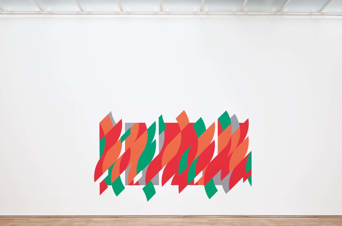
Bridget Riley Rajasthan 2012. Graphite and acrylic paint on plaster wall. Staatsgalerie Stuttgart, 2015. © Bridget Riley 2017. All rights reserved
PM: You have chosen to accompany Cosmos with a particular selection of earlier works, beginning with your 1959 copy after Seurat’s Le Pont de Courbevoie (1886–7). Your paintings are almost sixty years apart; yet, both being comprised of individual colour particles, they seem connected. Can you comment on that?
BR: Jenny very much wanted to show the copy I made of Le Pont de Courbevoie. I copied it from a reproduction. But actually, it’s rather more of a transcription than a copy. My painting is in many respects quite different: in scale, in the proportion of the format and even in the choice of colours. It was pivotal in my change from a figurative to an abstract approach. The other paintings are chosen to try to make this clear. There is a connection across these sixty odd years and it seems to lie in the touches of colour used in both the Seurat copy and Cosmos. It is the separate, discrete nature of these touches that generates spatial movement and depth.
PM: What impressed you most about Seurat’s treatment of space?
BR: In Seurat’s painting the spatial movement is recessional, the tip of his paint brush conveying separate notes of colour. Nevertheless, he is beginning to move away from descriptive representation and towards a formal equivalence in painting. He passes his own response to nature on to the viewer. Sensations, however elusive and fleeting, become the building blocks of his picture-making.
PM: I would suggest that by engaging with purely pictorial elements—simple shapes and colours—your work takes this a step further. Your painting has an autonomy, and its relationship with nature is very much one of equivalence rather than description. It stands on its own, but the sensations it generates exist parallel to nature.
BR: Yes, that is my intention, as best I can.
PM: What lessons did you learn as a result of making your copy from Seurat?
BR: I followed his mind—not his method. I felt like a detective trying to solve a mystery.
PM: Were you able to come to any firm conclusions?
BR: In essence his work remains mysterious, and so it should. It’s part of Seurat’s vocabulary: a veil deliberately drawn. But by managing to penetrate some areas of his thought I felt able to try to make a painting like Pink Landscape (1960). The copy had given me a way into thinking about colour. It was a fundamental lesson. The other major principle Seurat demonstrates is his use of contrast. Altogether, my involvement with his work gave me a sense of the viewer’s importance as an active participant. Perception became the medium.
PM: Through looking at Seurat, you were of course connecting with painters who form an even longer tradition.
BR: That is true, and crucial. Painters have always looked at and learnt from one another. It is, in fact, a compliment and a time-honoured way of passing on insights. There are significant lines of thought that extend from earlier artists. For example, Monet looked at Titian, whose famous sunsets would have caught his eye. With Seurat you look at how he saw.
PM: Your relationship with Seurat is particularly close, and arises from a shared concern with the role of perception. Can you say why perception is so important in your work?
BR: One has to remember that perception is not a state of mind that can be just picked up and adopted at will, but is a fact of life.
PM: Our experience of reality is constituted in perception. The way we interpret sensation constitutes our model of the world.
BR: Perception has an intellectual tail and is closely linked to insight. We are all sometimes surprised by what we perceive, and this faculty can be trained, cultivated and developed to high levels. One lives to understand. I do not start my work with a destination in mind. The working process is one of discovery, and it is worth remembering that through discovery one uncovers that which is hidden.
PM: Do you think that recognition forms part of that process?
BR: Yes, I do.
PM: I would say that your work certainly returns the observer to a heightened awareness of perception, and at a fundamental level it is a celebration of visual experience. You have referred in the past to the importance of the pleasures of sight.
BR: The pleasures gained from looking at works of art and the world around us are inexhaustible. As Delacroix said, painting should be a ‘feast for the eyes’. That is a view to which I attach great importance. Looking is, I feel, a vital aspect of existence. Perception constitutes our awareness of what it is to be human, indeed what it is to be alive.
